The project focuses on creating a cohesive visual language that reflects the brand’s contemporary and expressive character. Through a combination of strong typography, structured layouts, and graphic elements, the design communicates GOTOMA’s identity while maintaining a visually engaging and recognizable aesthetic across different formats. Responsible for the visual concept and merchandising design.
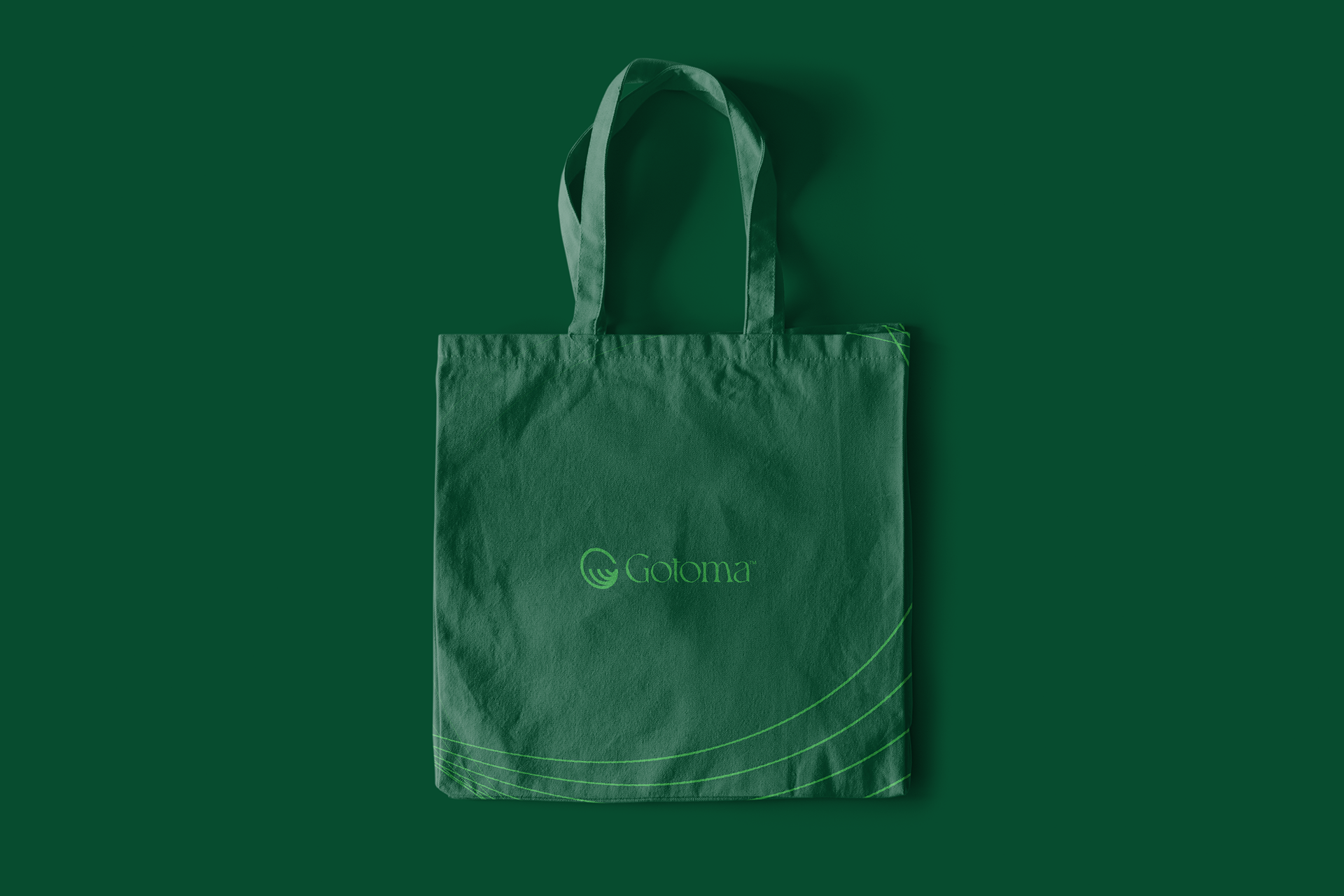
COLOR SCHEME The project relies on a restrained color palette dominated by greens, blacks, and whites. This limited palette creates a strong visual consistency across posters and merchandise while reinforcing a modern and clean aesthetic. The contrast between dark and light tones highlights the graphic elements and enhances the overall visual impact of the compositions.
LAYOUT An asymmetrical layout structure is used throughout the designs, allowing flexibility and dynamism in the arrangement of text and graphic elements. This approach introduces visual movement and reflects the contemporary nature of the brand while maintaining balance and readability across different applications.
IMAGERY The visual system combines photography with abstract graphic elements, creating a dialogue between imagery and design. Green-tinted visuals introduce a distinctive stylistic layer, while graphic shapes and repetitive elements add rhythm and energy to the compositions, reinforcing the brand’s creative and modern identity.
TYPOGRAPHY Bold and minimalist typography plays a central role in the design. Repetition of key words and graphic text elements creates a visual rhythm that ties the entire project together. This typographic approach strengthens the brand identity while guiding the viewer’s eye through the posters and merchandising pieces.