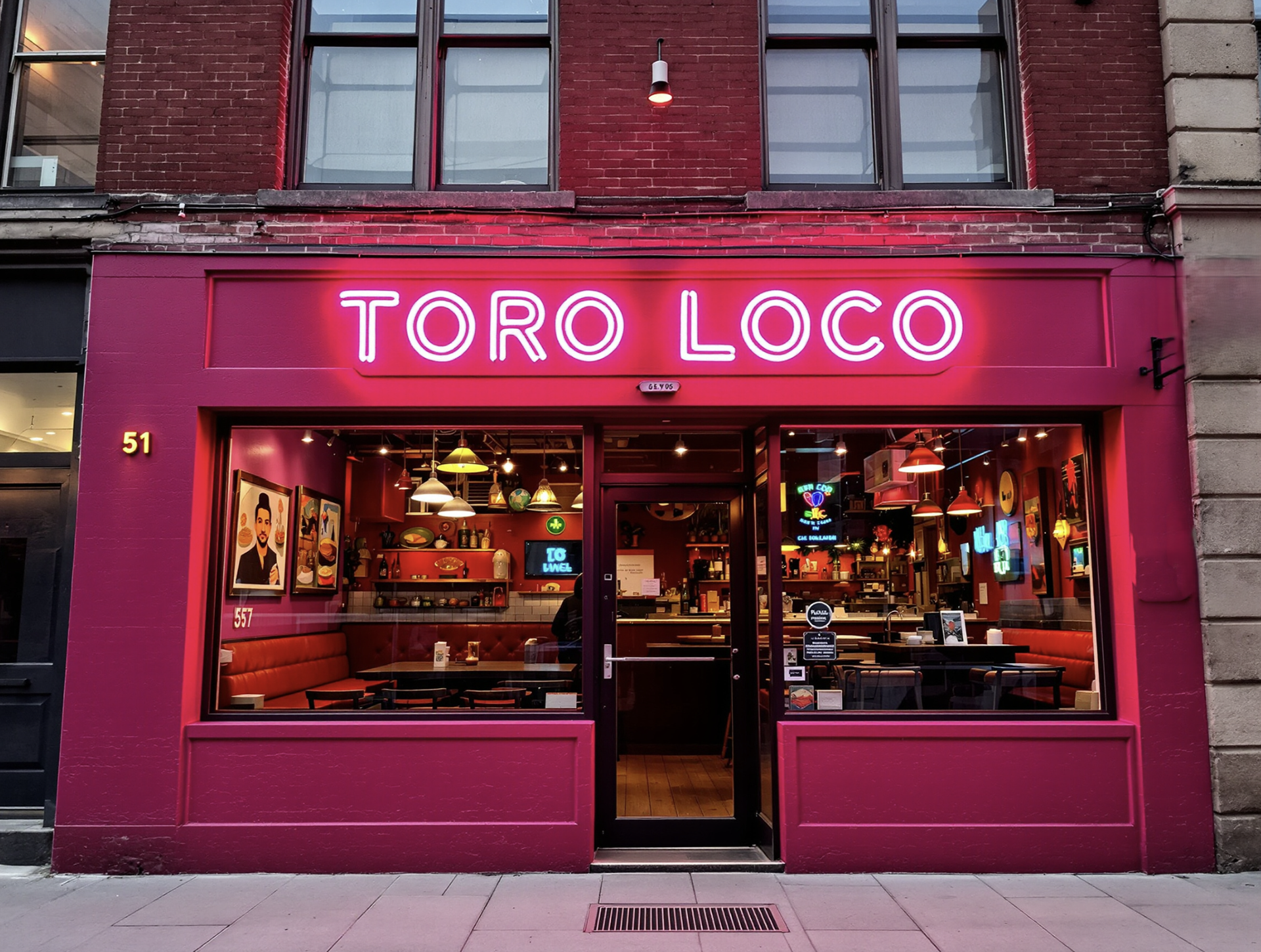
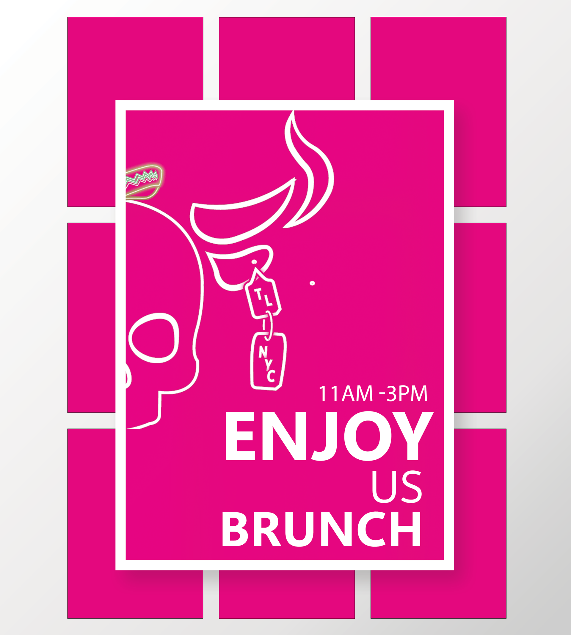
CONCEPT The redesign concept for "Toro Loco" restaurant presents a bold and energetic visual identity aimed at capturing the attention of a younger, more vibrant audience. The design leverages neon aesthetics, playful typography, and a modern color palette to create a brand that is both contemporary and deeply rooted in the lively spirit of Mexican culture.
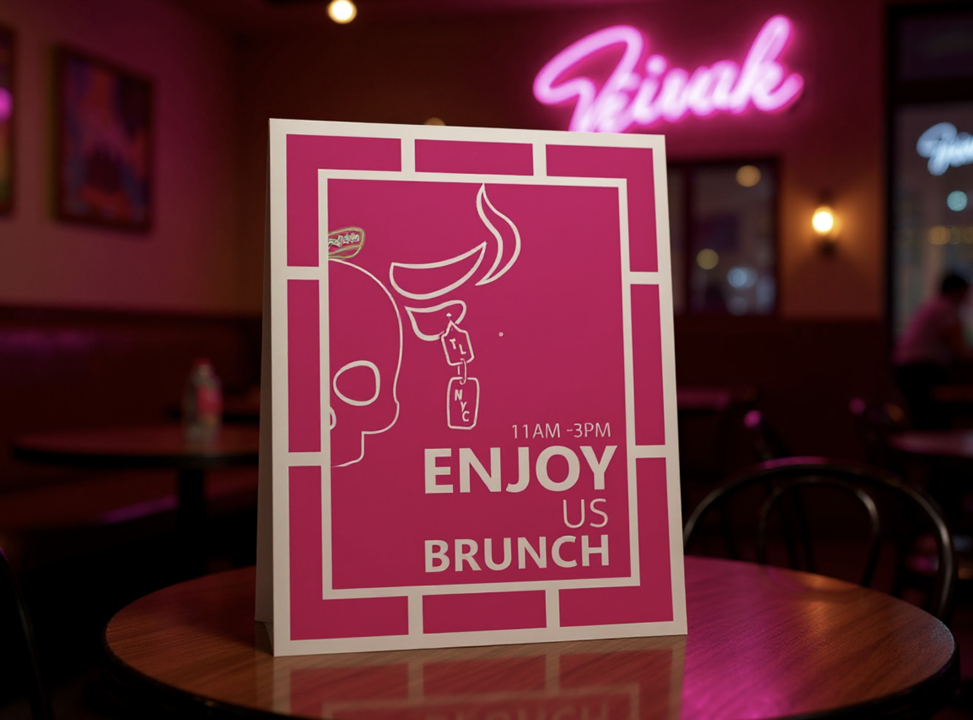
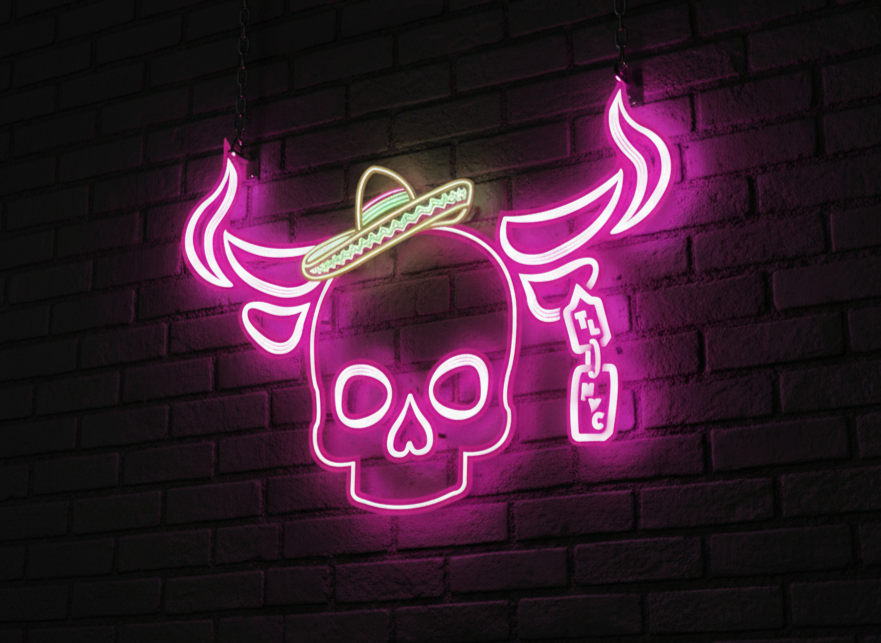
LOGO The centerpiece of the brand is the neon skull logo, adorned with a sombrero, which merges traditional Mexican iconography with a modern twist. The neon effect not only makes the logo visually striking but also evokes the nightlife culture, making it appealing to a youthful crowd who enjoy dynamic and trendy environments.
TYPO & COLOR The typography chosen is bold, rounded, and playful, which complements the energetic vibe of the brand. The font is both modern and approachable, ensuring that the brand feels accessible and appealing to the target demographic. The use of neon-styled text further reinforces the nighttime, party atmosphere. The use of bright pinks and purples, alongside black and white, infuses the brand with a sense of energy and excitement. These colors are not only eye-catching but also create a strong brand identity that is easily recognizable. The vibrant tones reflect the fun and lively atmosphere of the restaurant.
Advertising Poster
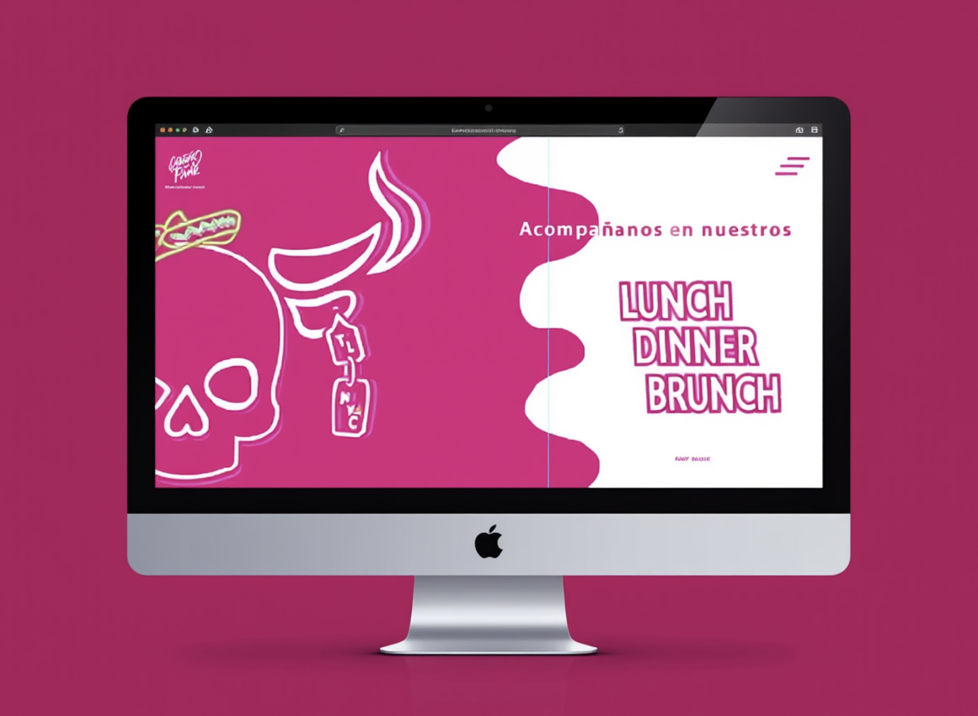
Web Design Header
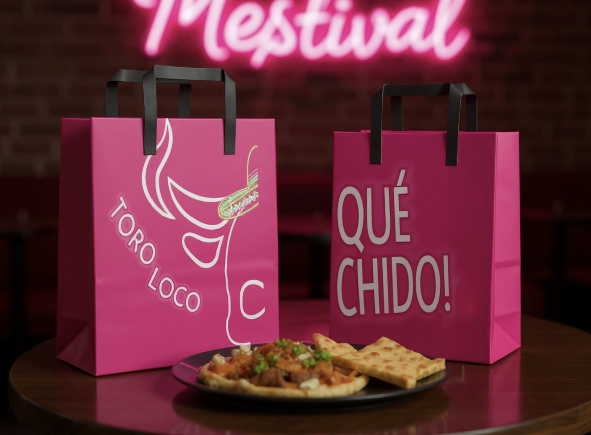
To Go Design Packaging
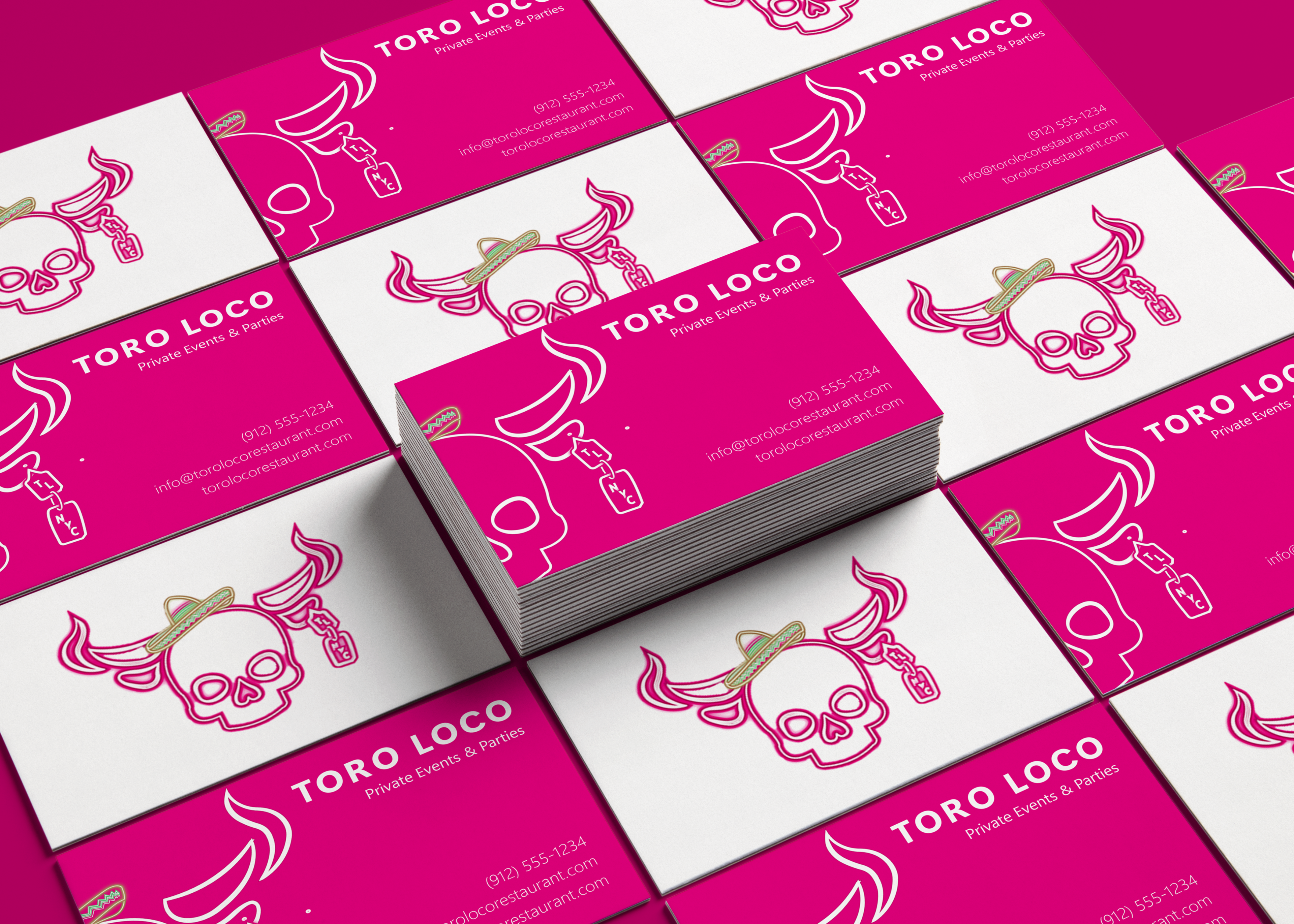
Business Cards Design and Print
Flyers Post
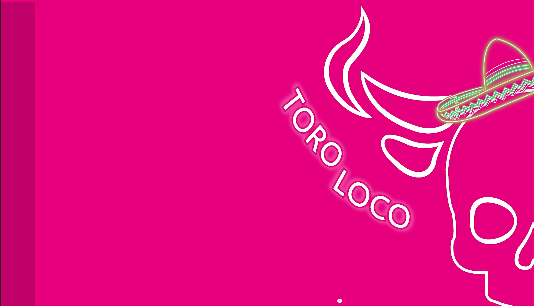
Brand Book Header
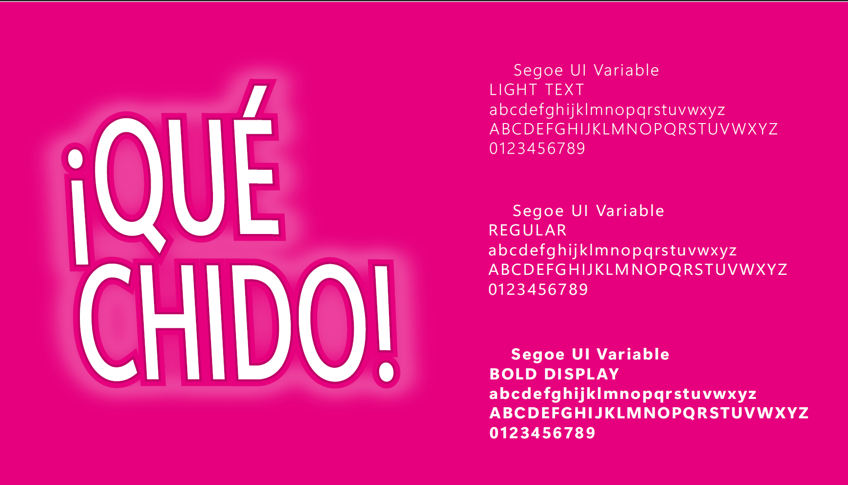
Brand Book Concept
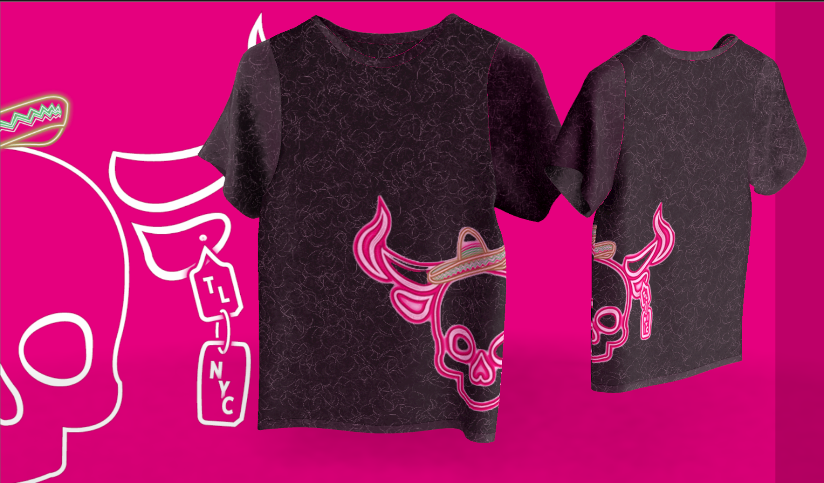
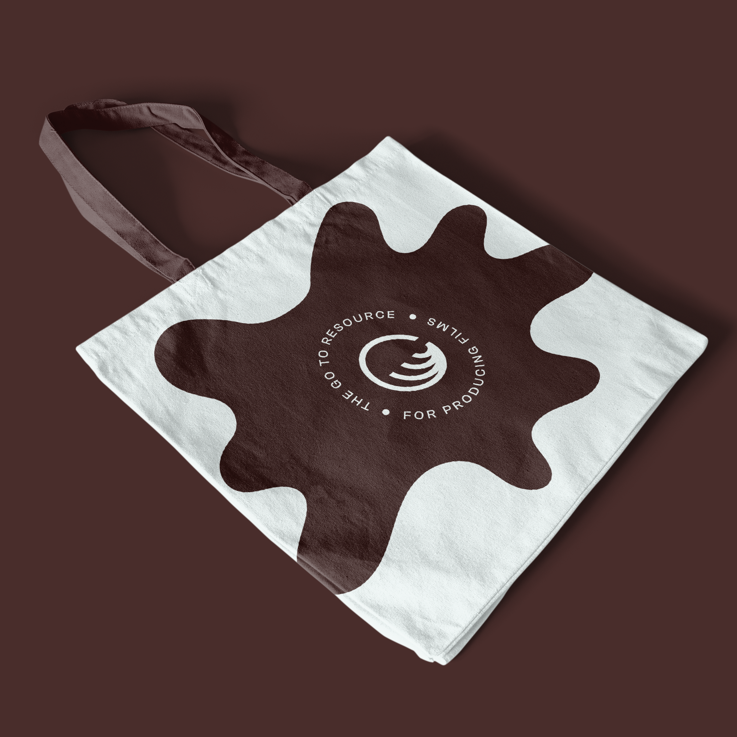
Merch Shirt Design
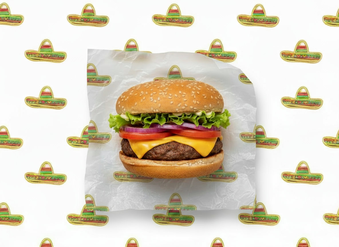
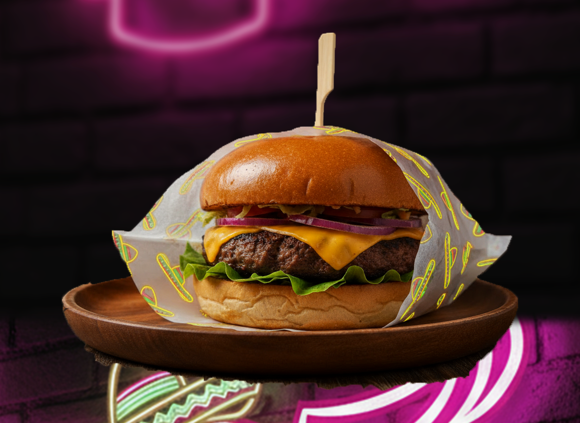
Wrap food paper Design
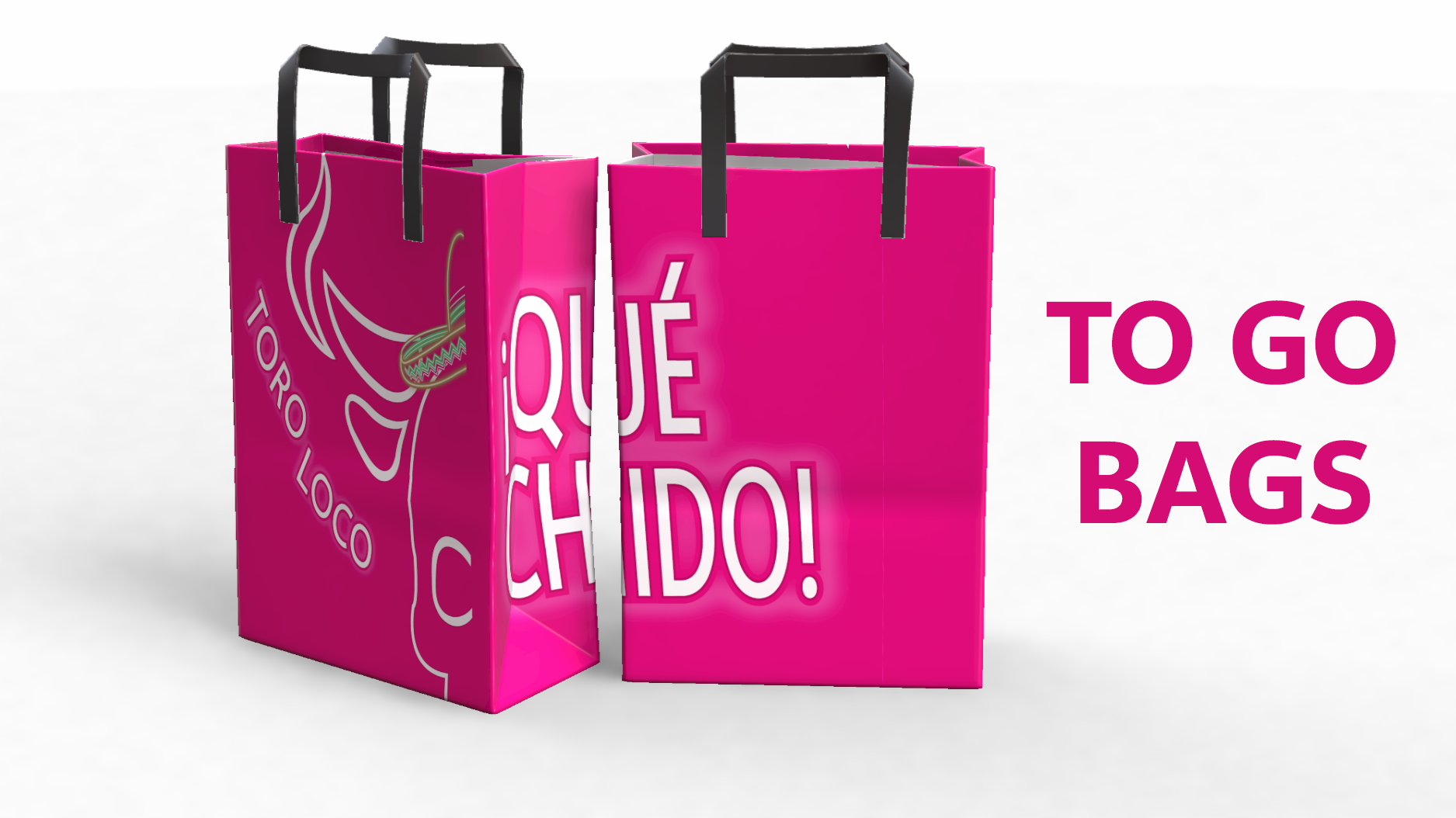
Simultaneous Design Packaging Bags