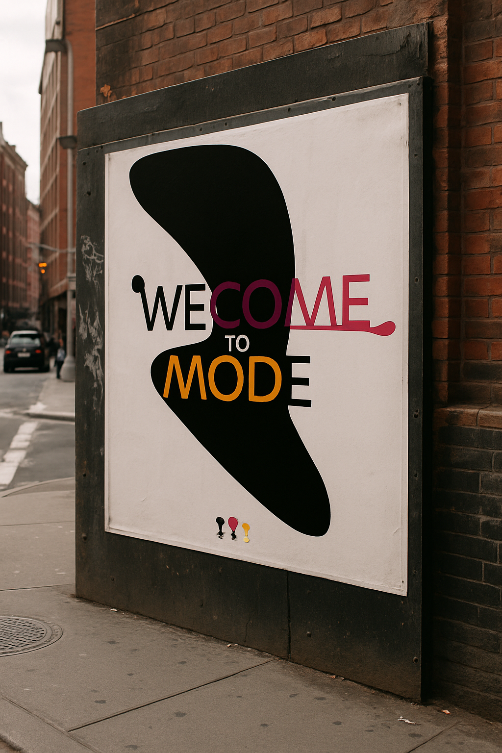
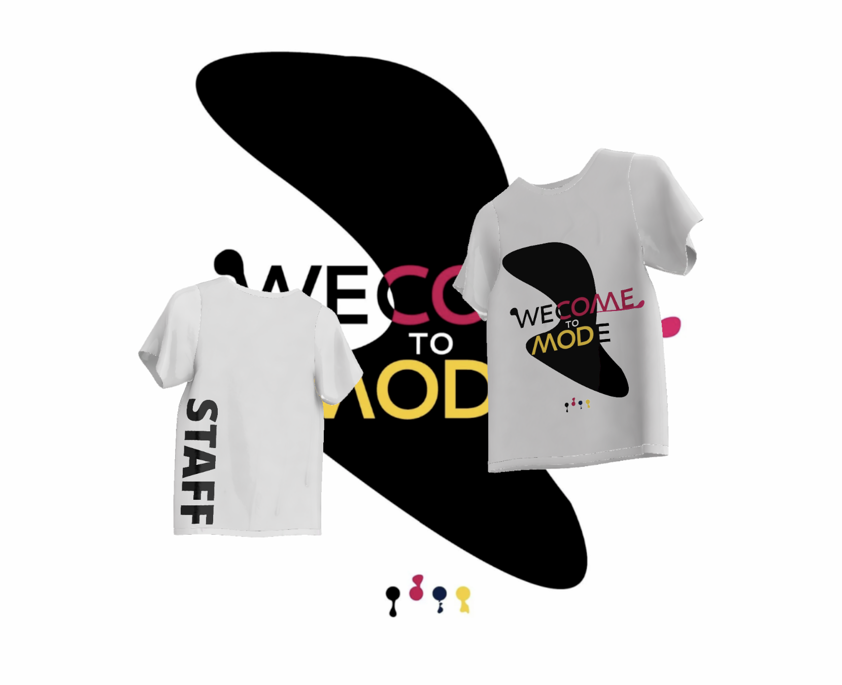
FASHION EVENT The design for the "We Come to Mode" event is a visually striking and conceptually rich representation that elegantly merges the worlds of fashion, design, and knowledge. The design captures the essence of the event's purpose: to invite and engage a diverse audience in an immersive experience of creativity and style.
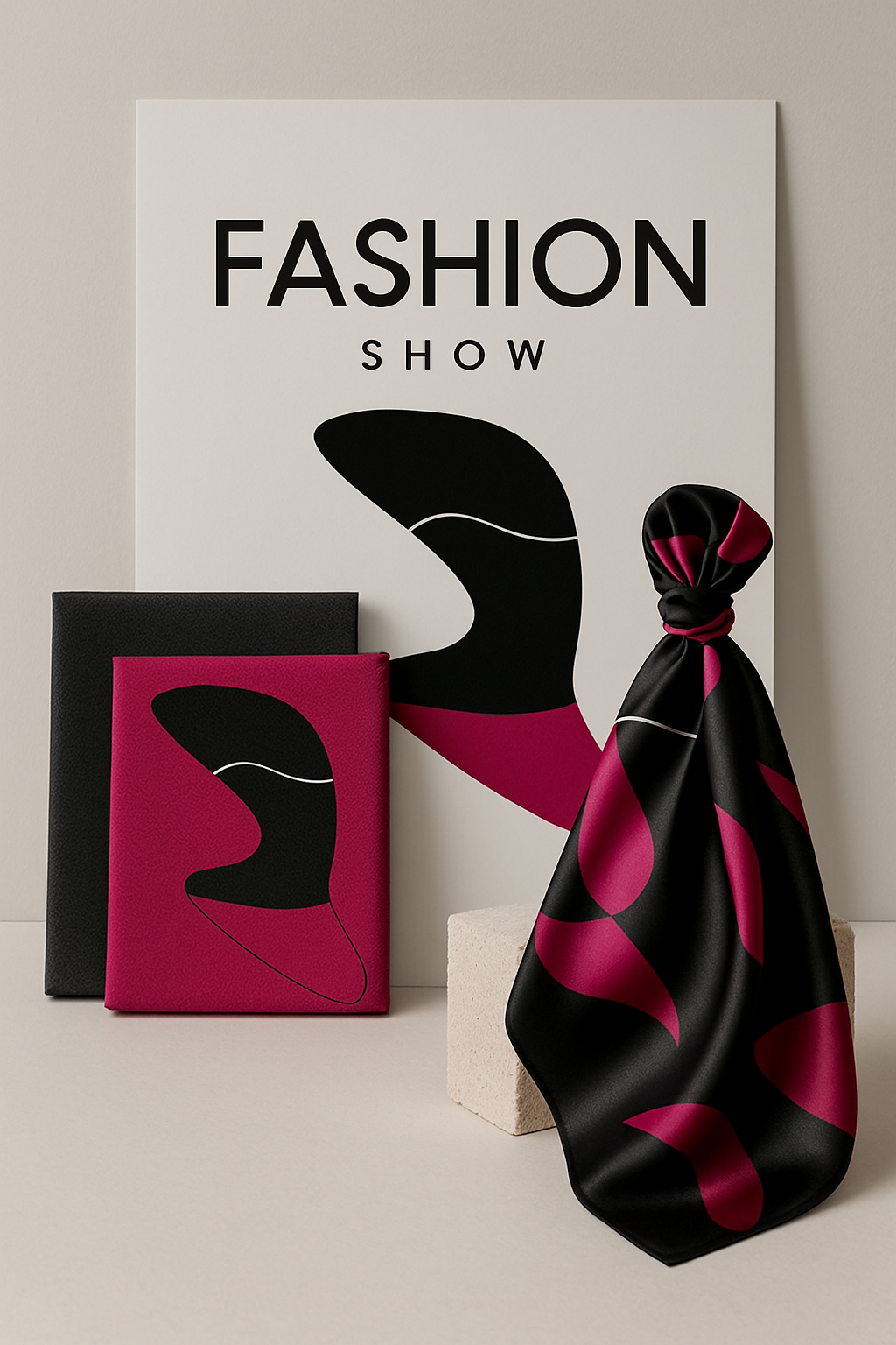
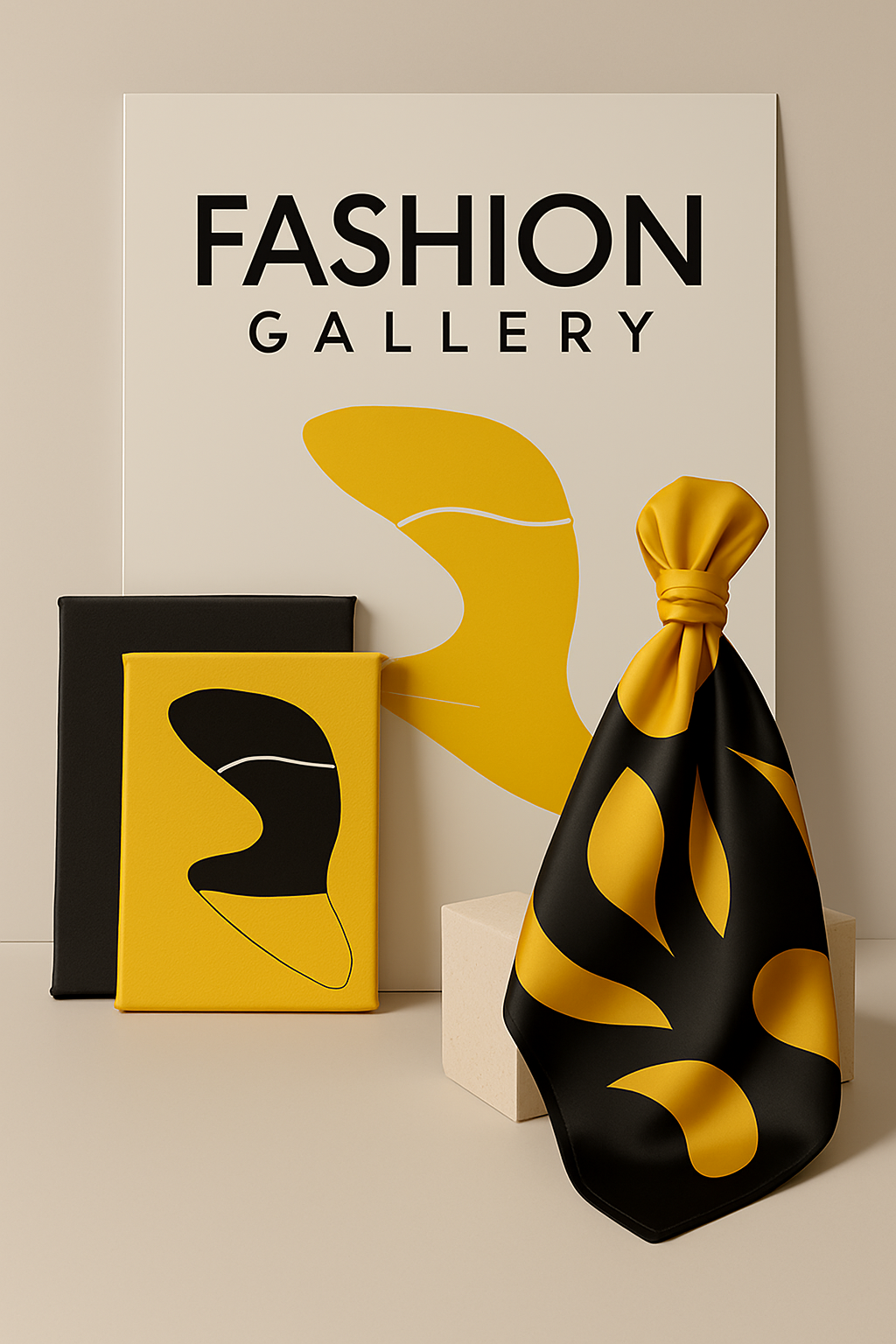
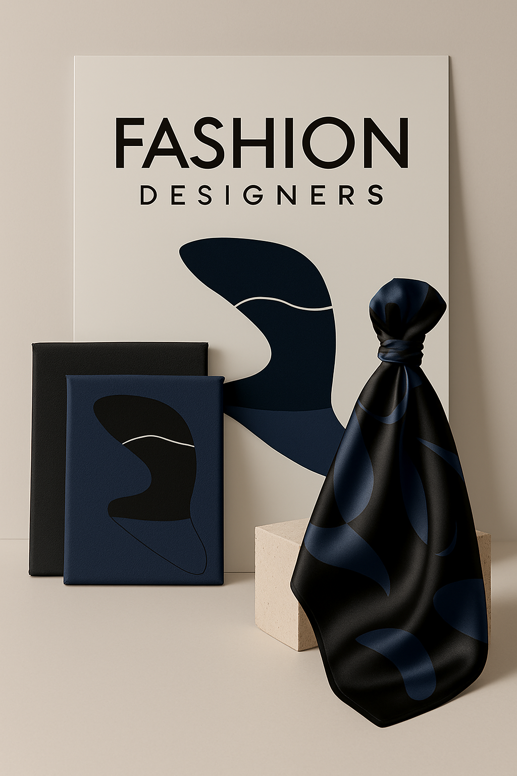
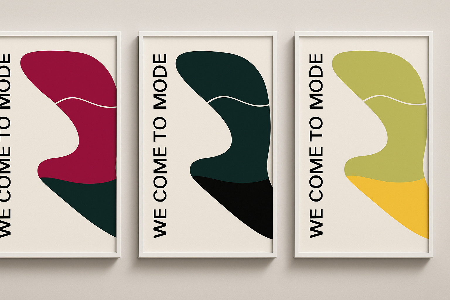
ICONIC SHAPE The large, abstract black shape in the background is reminiscent of a fashion accessory, perhaps a hat or a dramatic silhouette, subtly referencing the central theme of the event—fashion. It adds a sense of mystery and elegance, encouraging curiosity and anticipation among the viewers.
TYPOGRAPHY The bold and modern typography used in the words "WE COME" and "MODE" plays with color and form, reflecting the innovative spirit of the fashion industry. The vibrant pink and yellow colors symbolize energy, creativity, and inspiration, inviting attendees to engage with the event's dynamic atmosphere.
SYMBOLIC COLORS The use of black, pink, and yellow as the primary color palette is intentional. Black represents sophistication and timeless style, pink conveys passion and innovation, while yellow brings a touch of brightness and optimism, suggesting a forward-thinking approach to fashion and design.
PLAYFUL COMPOSITION The playful arrangement of the letters, especially in the word "COME," where the letter "E" seems to stretch out, gives the design a sense of movement and fluidity. This mirrors the fluid and ever-changing nature of fashion and design, where trends and ideas continuously evolve.