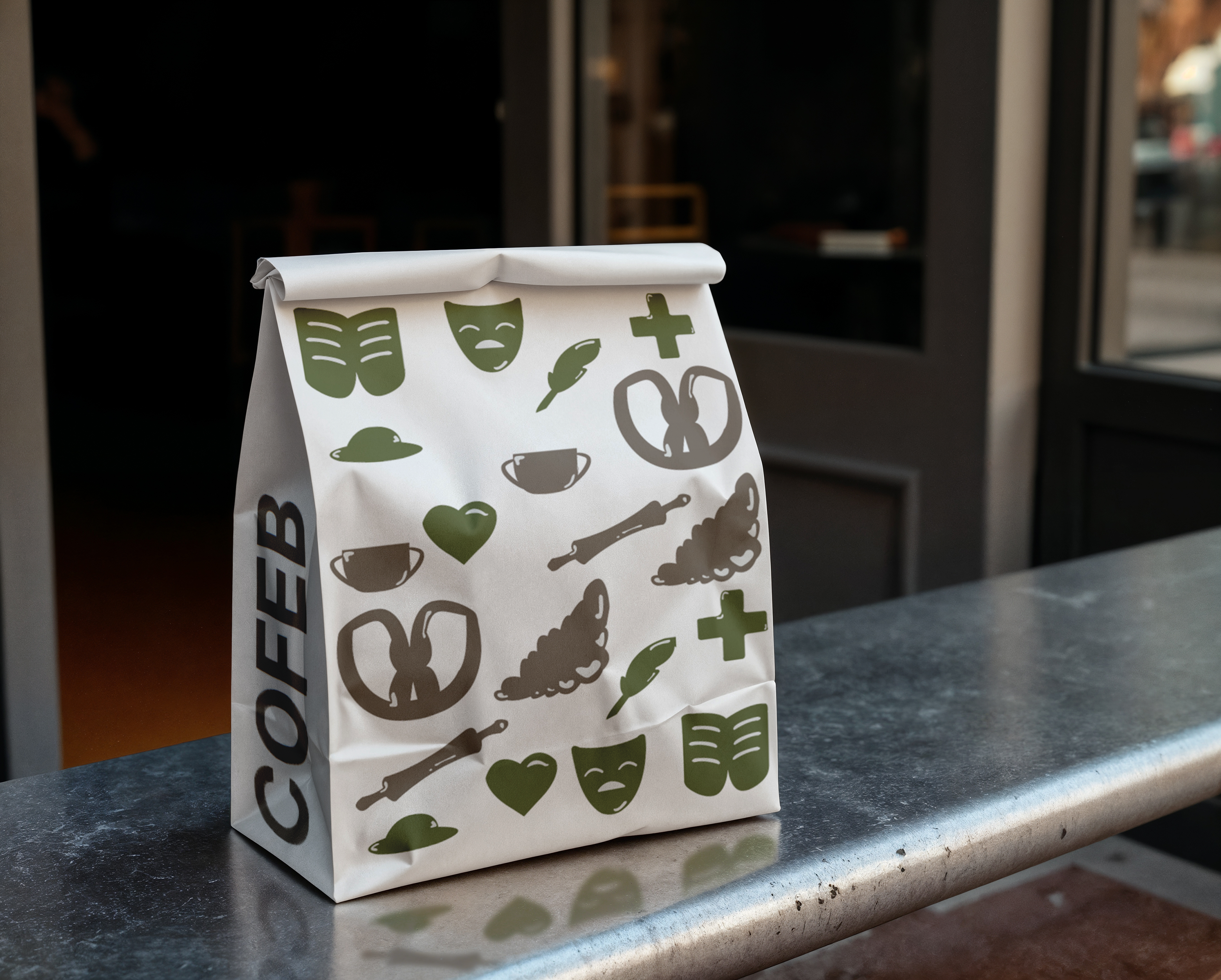
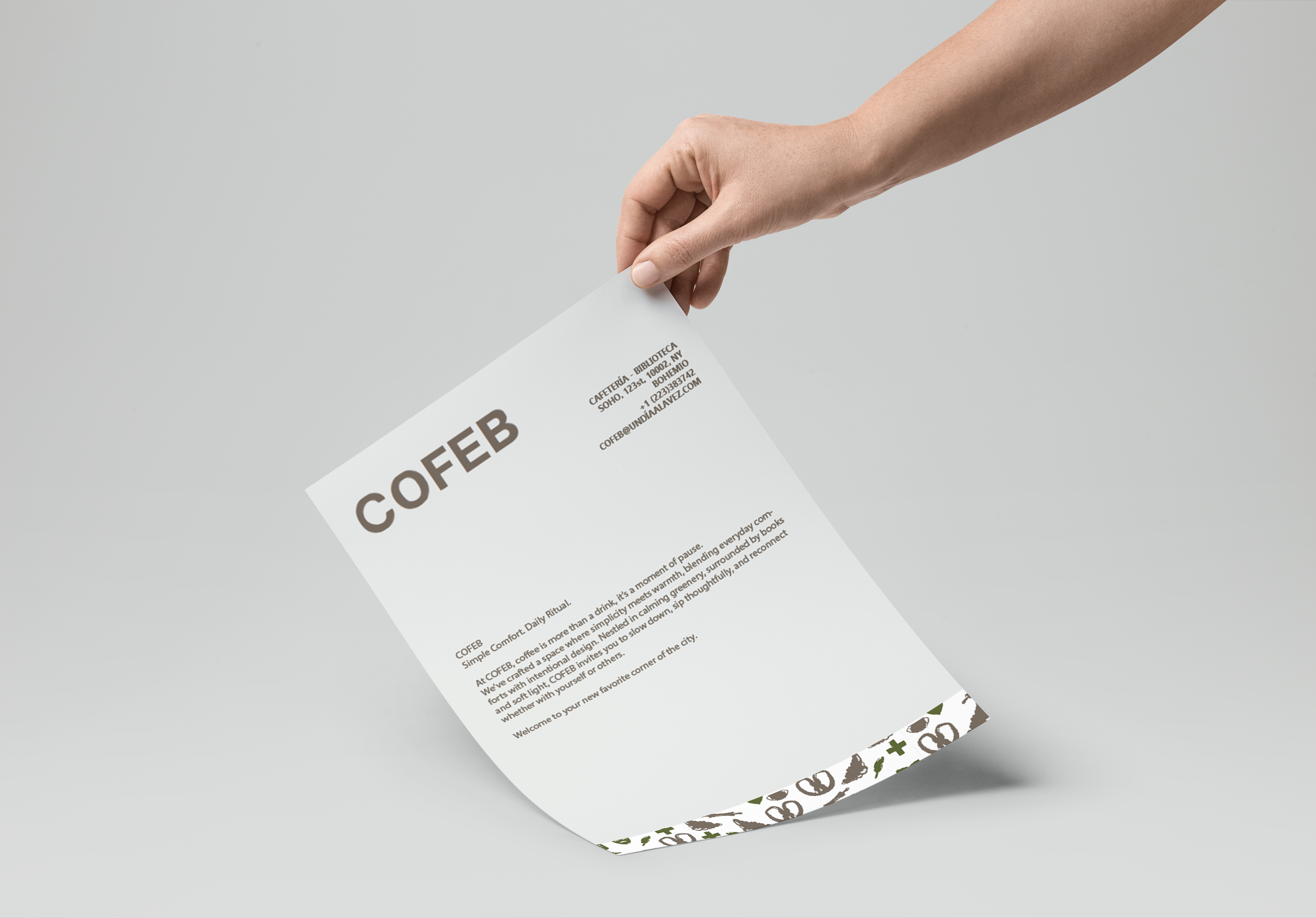
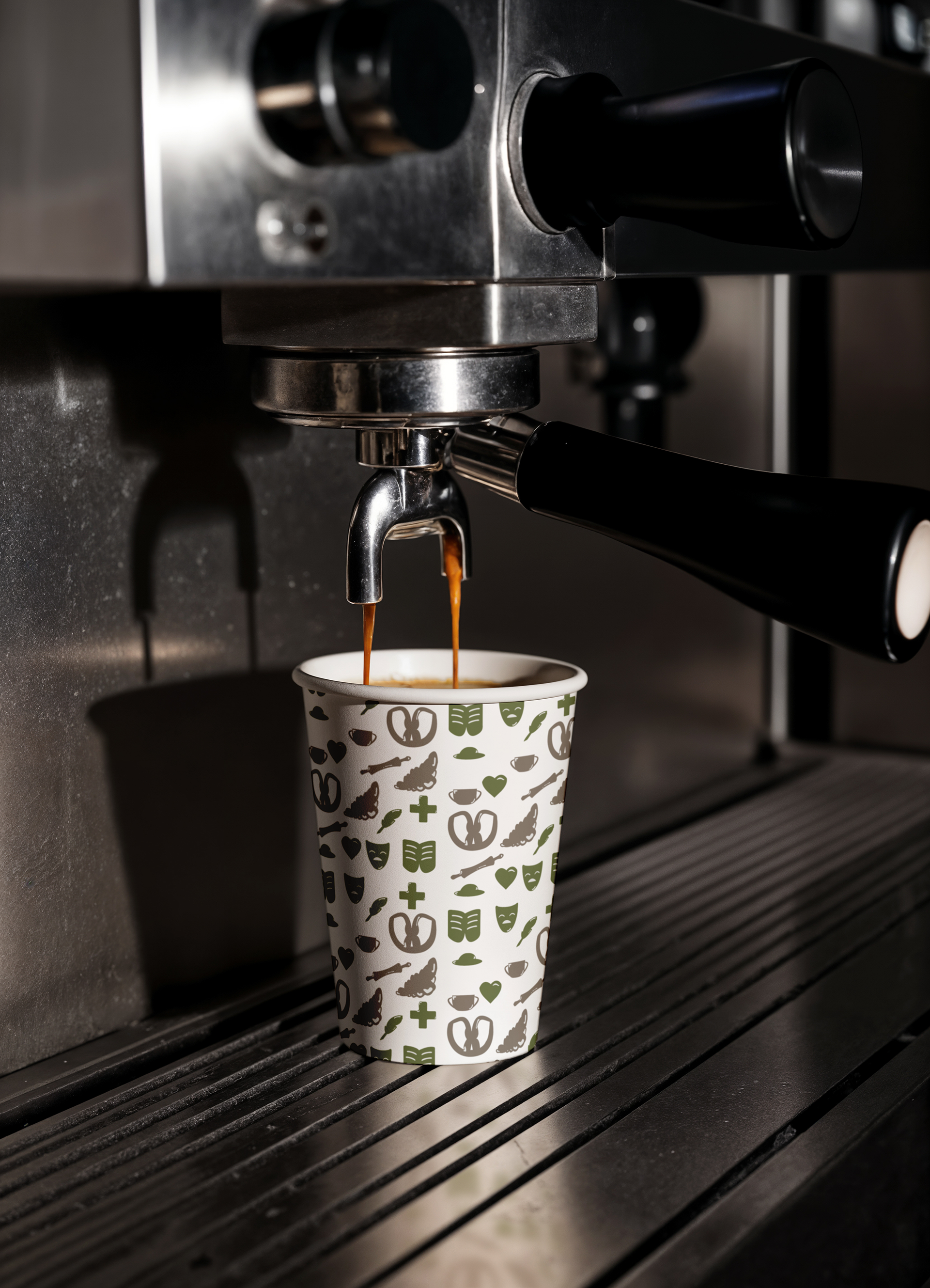
This project explores the branding and visual identity of a modern coffee shop designed around simplicity and everyday comfort. The space offers standard coffee and pastry selections but elevates the customer experience through thoughtful differentiators: a cozy, home-like environment with green spaces, a curated mini-library, and a design that encourages calm and creative pause amid the city's hustle.
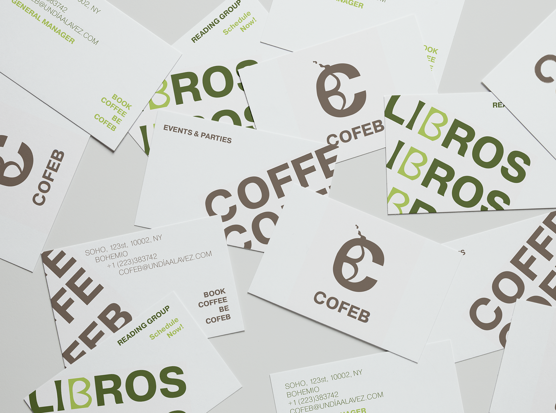
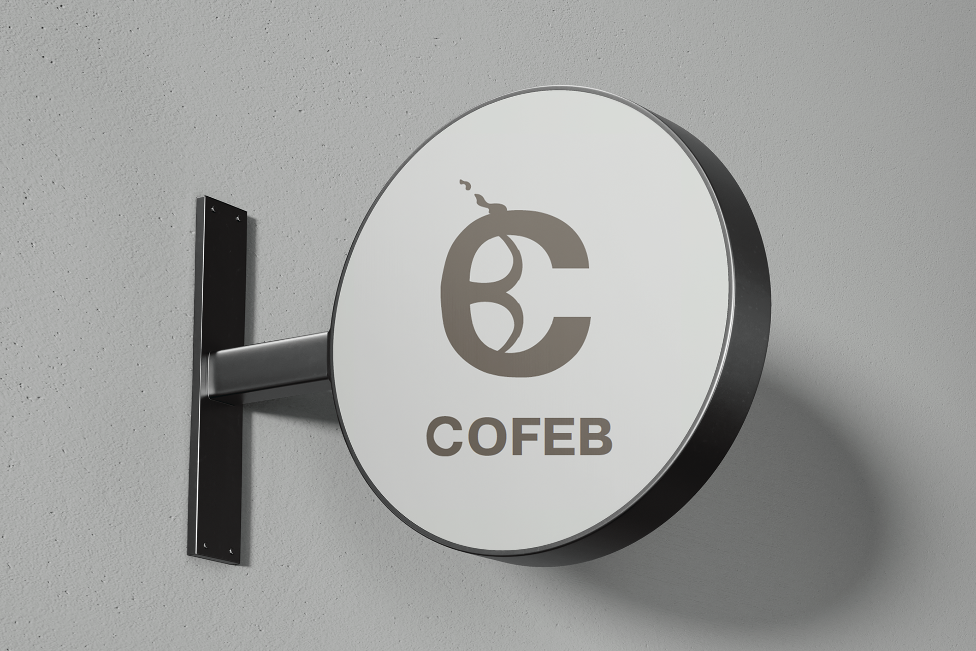
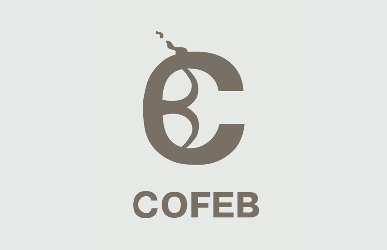
NAMING The name COFEB stems from the simple idea of merging a coffee shop with a library—bringing together coffee, food, and books to create a space for enjoying "one day at a time." It reflects the brand’s core values: modern, unique, and dreamlike.
The name combines “COFFEE” (in English, aligning with the location’s primary language) and the letter “B” from “BIBLIOTECA” (in Spanish meaning library) forming a short, memorable word that captures the essence of both concepts in a single identity.
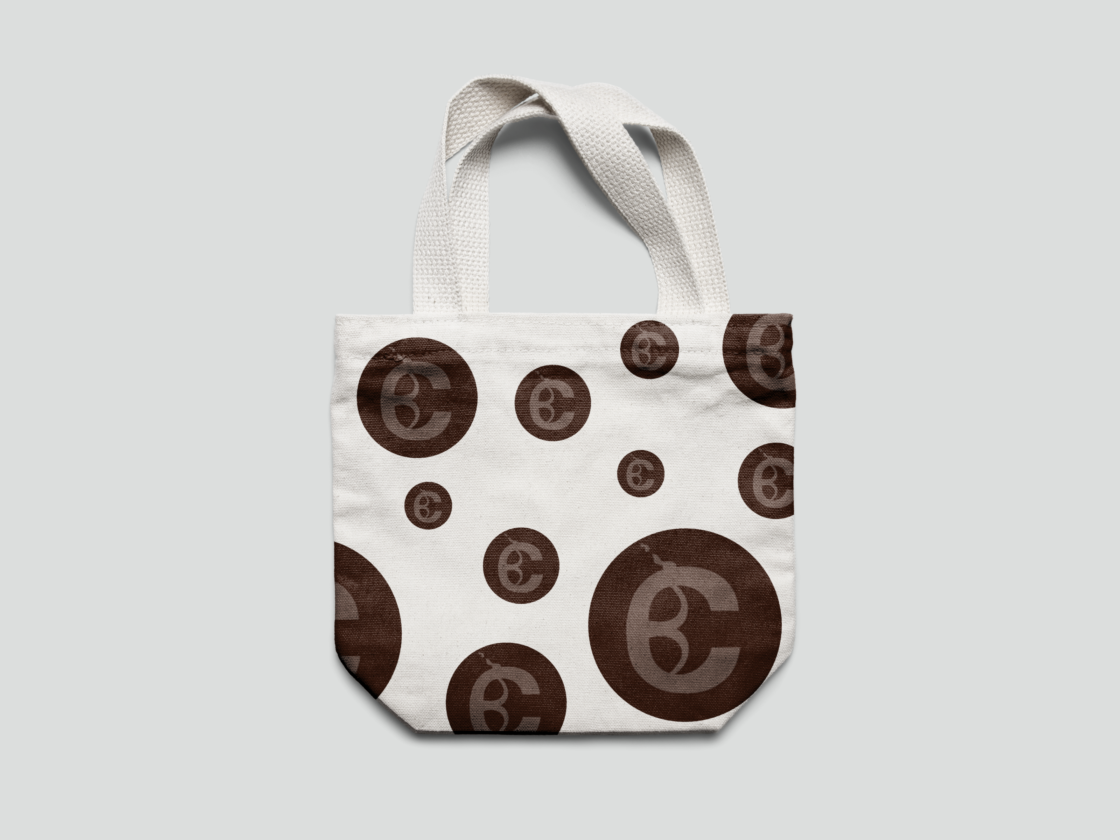
ICON DESIGN The icon design is built around the distinctive letter “C”, serving as the core of the brand's logo. It symbolizes the union with the letter “B”, subtly referencing the library concept. The steam element emerging from the top of the “C” evokes the warmth of coffee, adding a dynamic and recognizable visual touch.
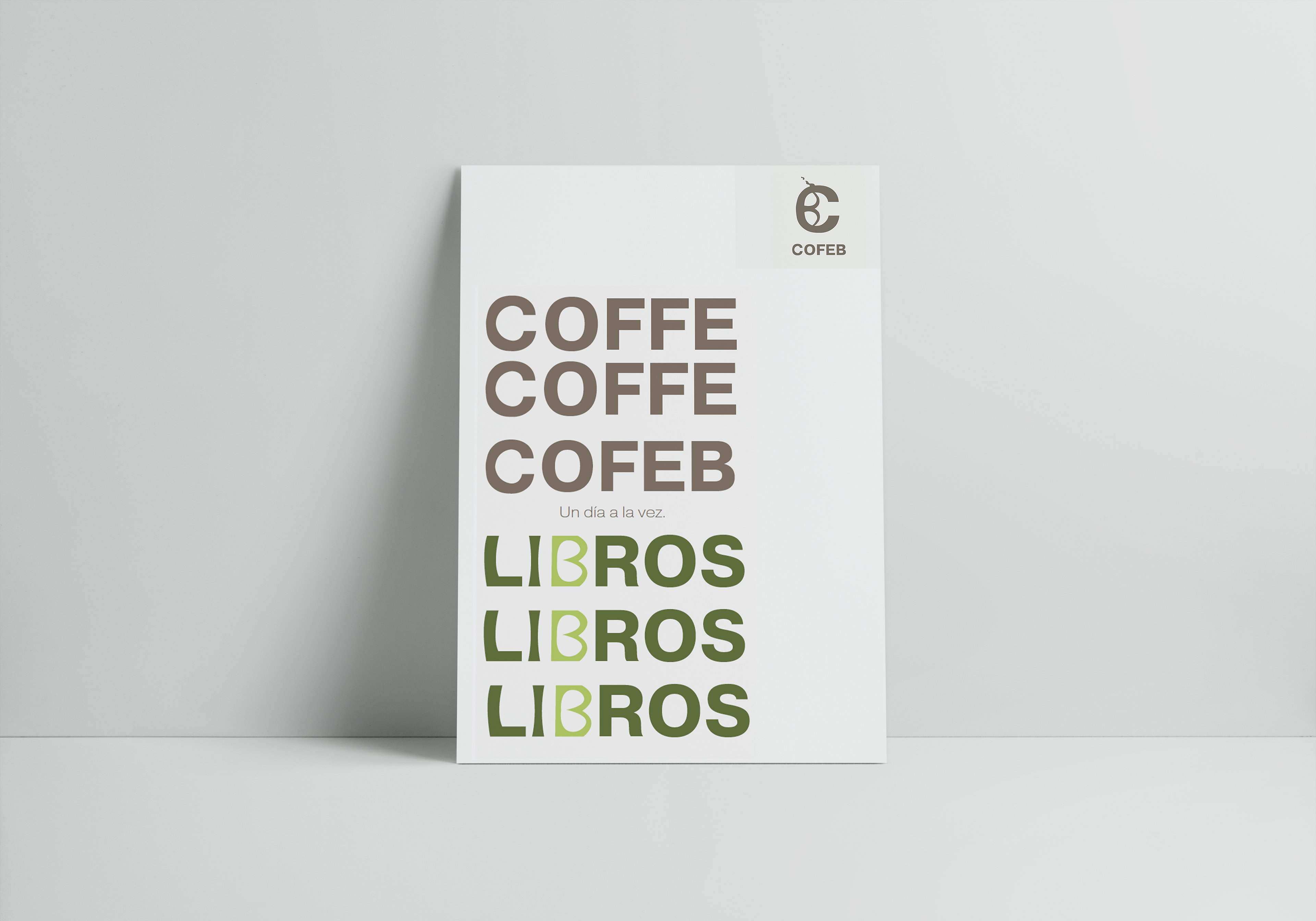
TYPOGRAPHY Plays a key role in creating a contemporary yet approachable tone, while the visual direction takes cues from the artistic and cultural vibe of the SOHO district, especially within the reading area. COFEB’s identity is built around a functional and modern typographic approach.
Pragmatica Bold is used as the primary typeface for the logo, offering strong visual presence and readability. It is complemented by Pragmatica Extended Extra Light for secondary text, adding balance and elegance. For longer text blocks, Gadugi is introduced due to its clarity and ease of reading. This typographic combination strengthens the brand’s visual consistency while maintaining a contemporary and versatile style.
COLORS The visual identity is guided by the core concepts of modernity, uniqueness, and a dreamlike atmosphere, centered around the fusion of coffee, food, and books a philosophy of living one day at a time. The primary color palette features brown and beige, evoking a sense of warmth, authenticity, richness, and natural elegance. These tones reinforce the brand’s modern yet grounded character, creating a solid and inviting identity.
The result is a tranquil brand that invites connection, inspiration, and mindfulness, where coffee, books, and good food come together for a one day at a time lifestyle.