The design for "The Dot Dot Dot" magazine captures the essence of a publication that thrives on intellectual engagement, contemporary design, and the exploration of visual culture. Each spread of the magazine is a meticulous blend of typography, imagery, and content, creating a reading experience that is both thought-provoking and visually stimulating.
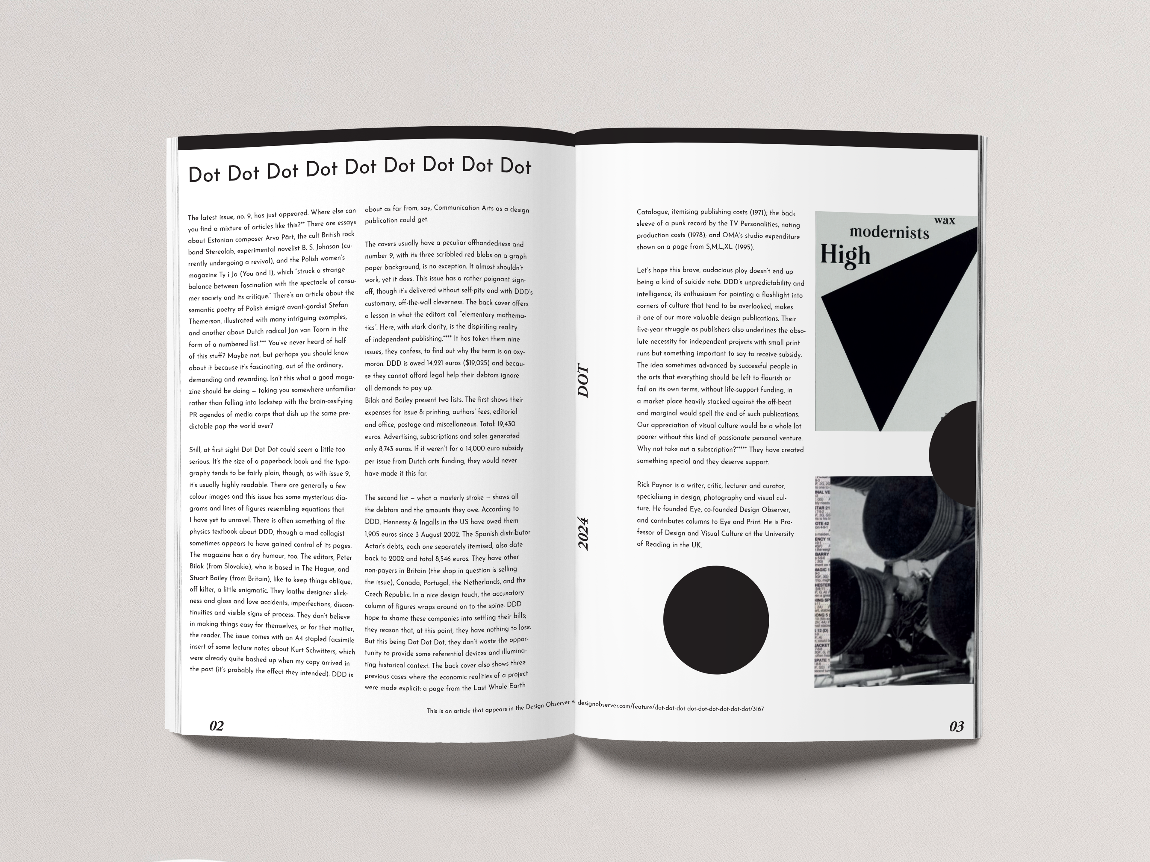
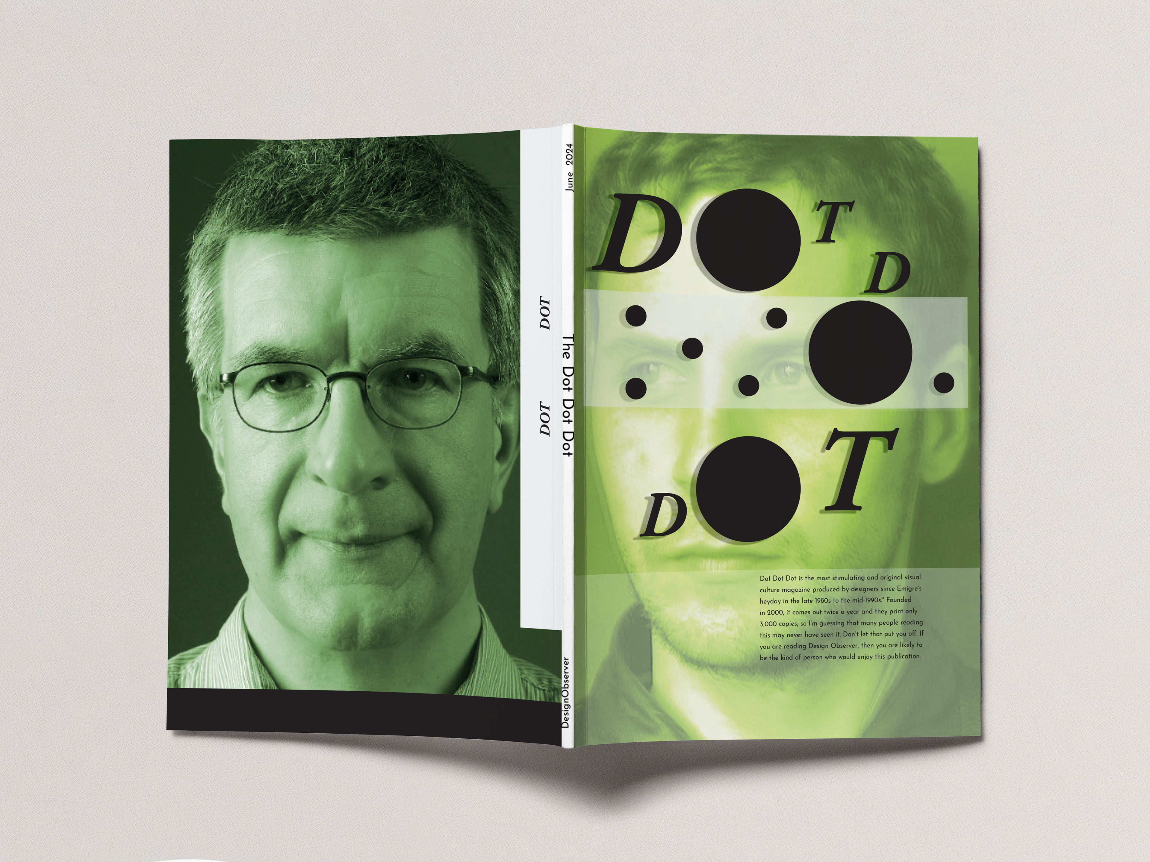
COLOR SCHEME The use of a limited color palette, primarily greens, blacks, and whites, lends a modern and sleek aesthetic to the magazine. Enhances readability and ensures that the focus remains on the content and its delivery.
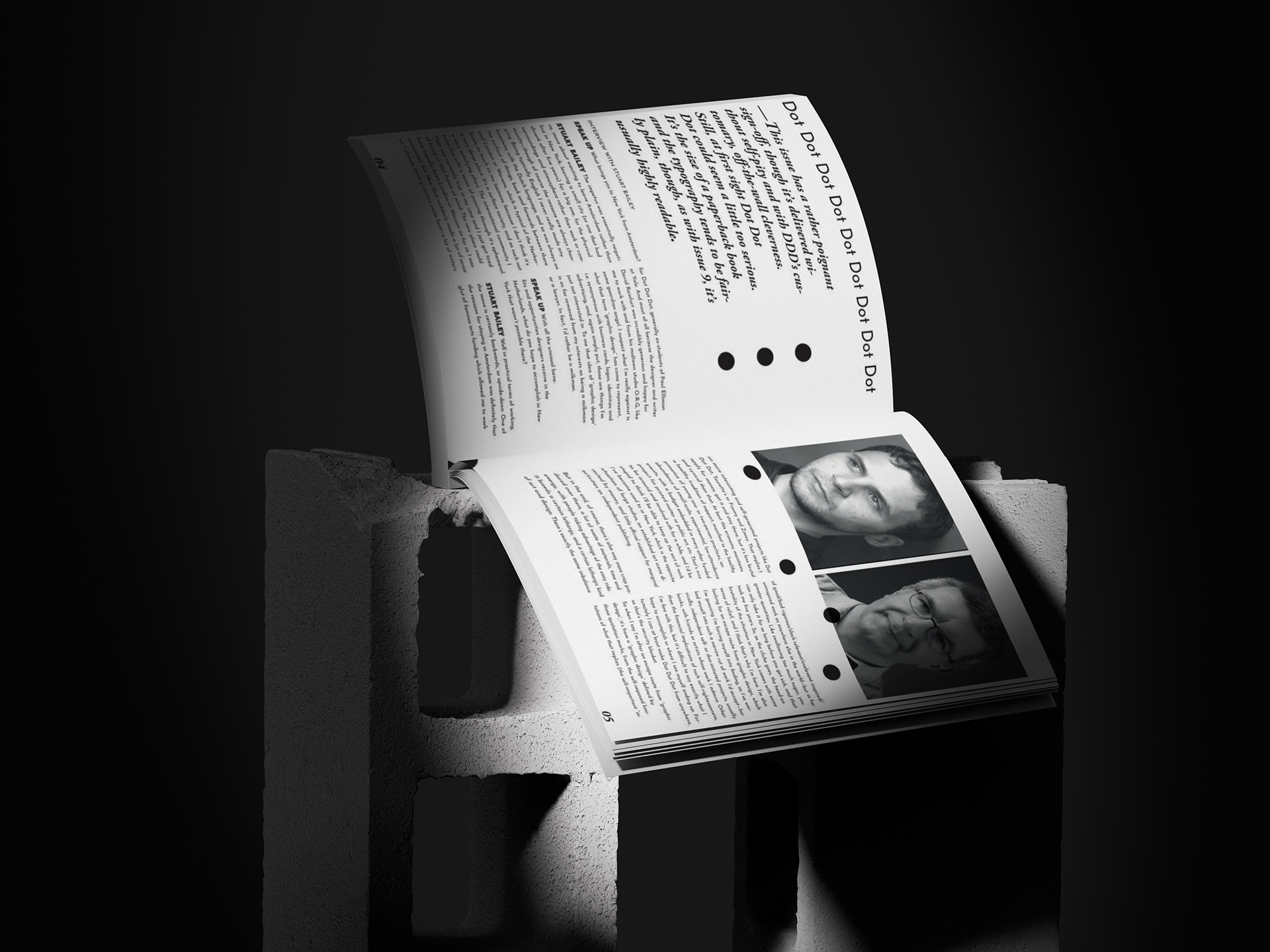
LAYOUT The asymmetrical layout, with its varying text alignments and the strategic placement of images, reflects the magazine's avant-garde approach. This design choice mirrors the intellectual and creative themes explored in the interviews and articles, challenging the reader to engage more deeply with the content.
IMAGERY The magazine skillfully integrates portrait photography and abstract graphics, creating a dialogue between text and image. The green-tinted portraits evoke a sense of modernity and freshness, while the placement of abstract dots and shapes adds a playful, yet sophisticated touch, emphasizing the magazine’s focus on design and culture.
TYPOGRAPHY The repetition of the words "Dot Dot Dot" throughout the design, combined with bold, minimalist typography, serves as a visual rhythm that ties the entire publication together. This repetitive element creates a cohesive identity for the magazine, reinforcing its brand while guiding the reader's eye through the content.
